Portfolio
Back GitHub
Table of Contents
Motivation
Inspired by Sharlene Yap's awesome website. I also wanted a website built from elements that I can fully control and customize. So I built this website from scratch using React and Next.js.
This was my second time working on a React/Next.js project. My first experience was a group project at uni, where I mainly worked on user authentication and didn't have much control over the project structure or design. So this project was still kind of overwhelming for me at first.
Design
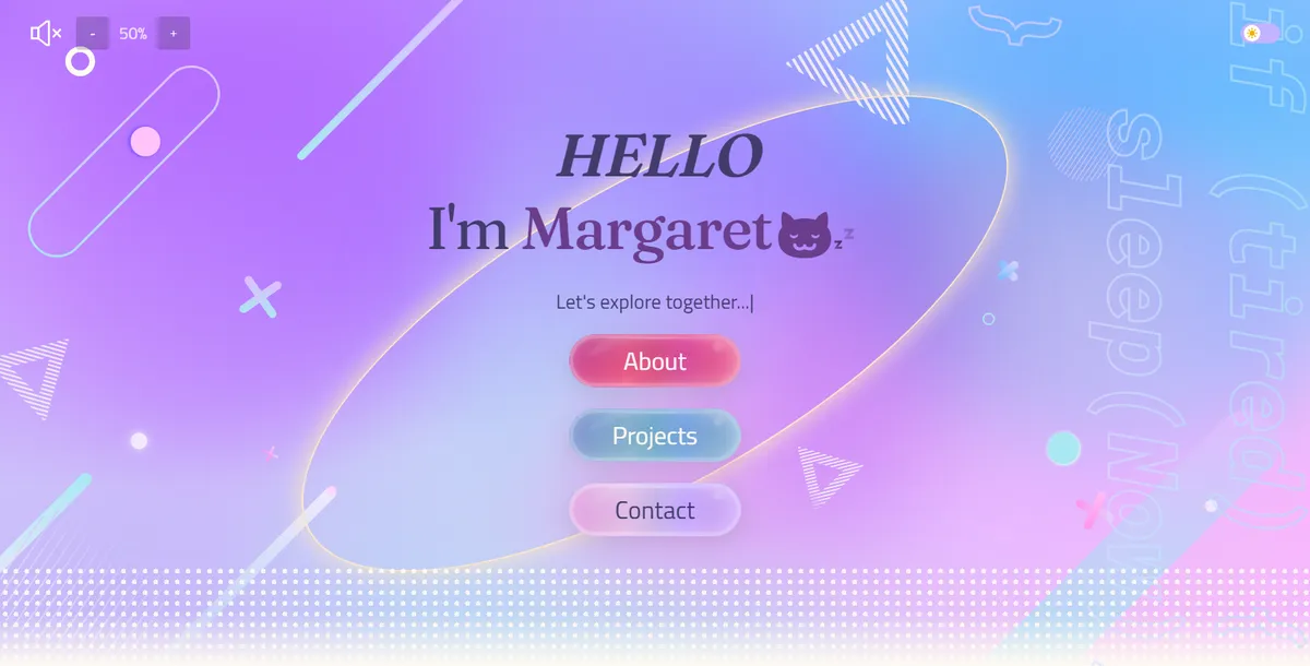
The BEST part of the project. I love pastel palettes, so using it as the main colour scheme was decided from the start. I couldn't find many good websites with this kind of colour scheme for reference, but that gave me more freedom: my biggest wish was to create a website that doesn't resemble other websites too much.
I used Figma to keep track of all my ideas and create the design. Hero section was determined first, other sections were improved or redesigned during the development.
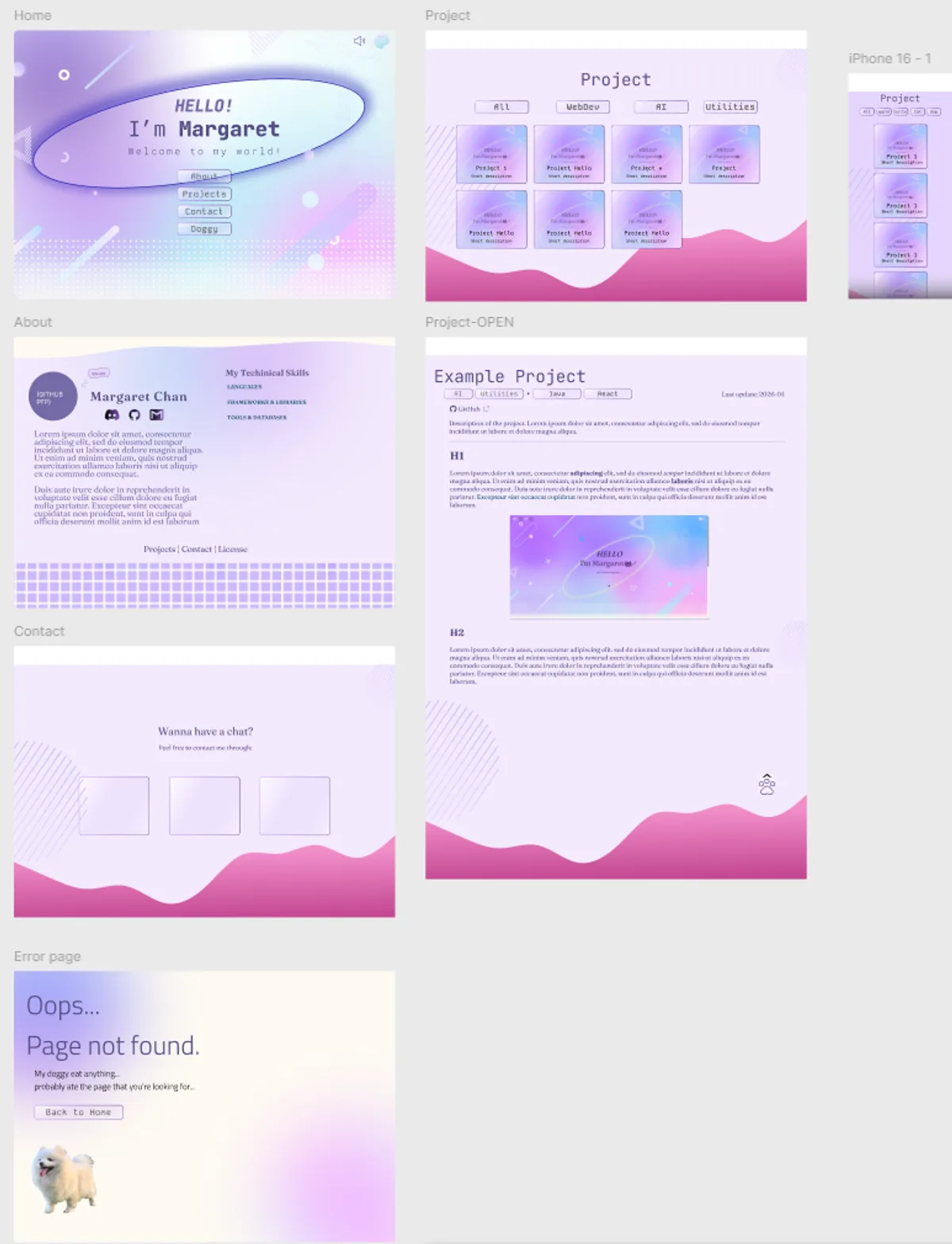
Figma prototype (v2): most pages were adjusted since my initial design.
Accessibility and responsive design
For accessibility, I used an accessible colour generator to find the right font colours and a contrast checker to verify the design. I also added dark mode and sound effects for fun. The design is mobile-first, so making the website look good on all screen sizes was a priority. Most pages contain two versions of the design, one for large screen (xl or 2xl) and one for smaller screen (sm or md).
My Thoughts on TailwindCSS
Many people say Tailwind makes the code messy but I usually store classNames as strings in constants and use the cn function to merge them, so it hasn't really been a problem for me. I think it works well for simple designs that don't require lots of custom styles. However, since I am doing pastel gradient designs, I often end up using traditional CSS or inline styling. Probably TailwindCSS isn't necessary for my case.
Update on (24/08/2025): After refactoring and centralising colours in globals.css, I find Tailwind is still useful for organising layout. Probably opposite to what most(?) people think. But I agree it is not necessary.
SVG issues
React Icons are great and very easy to use, but some icons are missing, like the C language logo, so I also use local SVG files.
But local SVGs caused a dark mode problem: when an SVG is loaded as an image (with <img> or Next.js <Image>), it is rendered as an external resource, so CSS can't change its colour.
Solution: I made a custom FetchImage component that fetches the SVG file, injects its content directly into the DOM using dangerouslySetInnerHTML, and applies CSS classes and inline styles.
My method works but probably not the most efficient (a bit overcomplicated). Will make a cleaner version if I have time. (i.e. never)
Lighthouse performance
I had very poor performance on mobile for LCP (Largest Contentful Paint) at the beginning. Three main reasons:
- Opacity set to 0 counted as invisible content, which led to Lighthouse error
- fixed by setting opacity to 0.01 instead of 0
- Motion animations delay the rendering of main content
- fixed by reducing the delay and duration of animations, especially for main text
- (faster animations actually look better)
- Too many elements loading at once
- fixed by progressively loading elements
Improvement in v2.0
After finishing my bachelor's degree, I finally had time to make this website more informative. Components that didn't match the pastel design were removed, and animations were sped up to make the website feel snappier. The initial version put the hero and about sections together on the homepage, but it looked information-sparse, so I split them. Homepage now only shows buttons to the key pages, and About got its own page.
Markdown renderer and project system
Two major new features added were the rich text Markdown renderer and a proper way to manage projects.
I added a markdown renderer that supports some custom syntax like spoilers, highlights and coloured text so I can create blog and project writeups in Markdown without touching the code.
I also added a project system for uniformity and maintainability. Each project now has a config file and a Markdown write-up. Some project info can be fetched from the GitHub repos.
Other improvements
Other things that were added:
- A 404 page with my pom ( ノ ゚ー゚)ノ
- Better UI and animations
- Better performance: e.g. prerendering hero buttons for faster LCP
Yapping time
I named the website Koi (恋), which means "love" in Japanese, and it is also named after one of my favourite characters, Koito (小糸) ꒰( ˶ ᷇ 𖥦 ᷆ ˵ )꒰ ♡.